Teasers can have a pretitle

Icon Title Icon Title Icon Title Icon Title Icon Title Icon Title Icon Title Icon Title
Icon Subtitle Icon Subtitle Icon Subtitle Icon Subtitle Icon Subtitle Icon Subtitle Icon Subtitle
Teaser Components
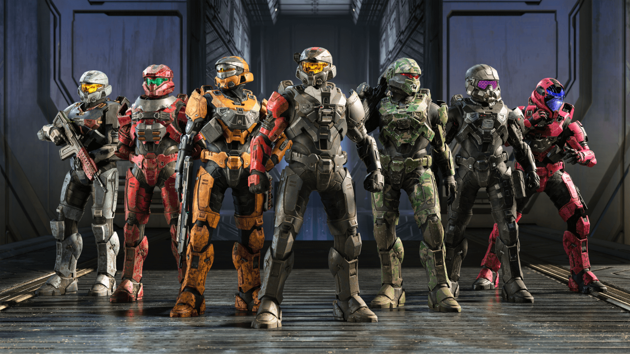
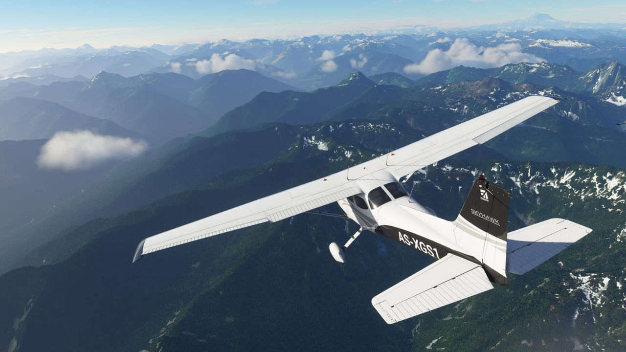
The Core "Teaser" Component can show an image, a title, rich-text, and optionally link to further content. This version has no style selections applied, and the layout system is forcing two teasers side by side. The Core "Teaser" Component can show an image, a title, rich-text, and optionally link to further content. This version has no style selections applied, and the layout system is forcing two teasers side by side. The Core "Teaser" Component can show an image, a title, rich-text, and optionally link to further content. This version has no style selections applied, and the layout system is forcing two teasers side by side. The Core "Teaser" Component can show an image, a title, rich-text, and optionally link to further content. This version has no style selections applied, and the layout system is forcing two teasers side by side. The Core "Teaser" Component can show an image, a title, rich-text, and optionally link to further content. This version has no style selections applied, and the layout system is forcing two teasers side by side. The Core "Teaser" Component can show an image, a title, rich-text, and optionally link to further content. This version has no style selections applied, and the layout system is forcing two teasers side by side. The Core "Teaser" Component can show an image, a title, rich-text, and optionally link to further content. This version has no style selections applied, and the layout system is forcing two teasers side by side. The Core "Teaser" Component can show an image, a title, rich-text, and optionally link to further content. This version has no style selections applied, and the layout system is forcing two teasers side by side. The Core "Teaser" Component can show an image, a title, rich-text, and optionally link to further content. This version has no style selections applied, and the layout system is forcing two teasers side by side.